
Table of Contents
Objective
As part of a one-day case study at Galvanize, I was provided with a dataset from a ride-sharing company (Company X) and tasked with developing a model to predict user churn and offer insights to help improve customer retention.
The Dataset
The dataset provided by Company X contained information on users who used the ride-share service between January 1 and July 1, 2014. For the purpose of predicting user churn, a user was considered retained if they were “active” (i.e. took a trip) in the preceding 30 days (from the day the data was pulled). In other words, a user is “active” if they have taken a trip since June 1, 2014.
Here is a detailed description of the data:
CATEGORICAL
city: city this user signed up in (the city names have been changed)phone: primary device for this user
NUMERICAL
signup_date: date of account registration; in the formYYYYMMDDlast_trip_date: the last time this user completed a trip; in the formYYYYMMDDavg_dist: the average distance (in miles) per trip taken in the first 30 days after signupavg_rating_by_driver: the rider’s average rating by their drivers over all of their tripsavg_rating_of_driver: the rider’s average rating of their drivers over all of their tripssurge_pct: the percent of trips taken with surge multiplier > 1avg_surge: The average surge multiplier over all of this user’s tripstrips_in_first_30_days: the number of trips this user took in the first 30 days after signing upweekday_pct: the percent of the user’s trips occurring during a weekdayluxury_car_user: TRUE if the user took a luxury car in their first 30 days; FALSE otherwise
Table 1: Example rows from initial dataset
| avg_dist | avg_rating_by_driver | avg_rating_of_driver | avg_surge | city | last_trip_date | phone | signup_date | surge_pct | trips_in_first_30_days | luxury_car_user | weekday_pct | |
|---|---|---|---|---|---|---|---|---|---|---|---|---|
| 0 | 3.67 | 5 | 4.7 | 1.1 | King’s Landing | 2014-06-17 00:00:00 | iPhone | 2014-01-25 00:00:00 | 15.4 | 4 | True | 46.2 |
| 1 | 8.26 | 5 | 5 | 1 | Astapor | 2014-05-05 00:00:00 | Android | 2014-01-29 00:00:00 | 0 | 0 | False | 50 |
| 2 | 0.77 | 5 | 4.3 | 1 | Astapor | 2014-01-07 00:00:00 | iPhone | 2014-01-06 00:00:00 | 0 | 3 | False | 100 |
| 3 | 2.36 | 4.9 | 4.6 | 1.14 | King’s Landing | 2014-06-29 00:00:00 | iPhone | 2014-01-10 00:00:00 | 20 | 9 | True | 80 |
| 5 | 10.56 | 5 | 3.5 | 1 | Winterfell | 2014-06-06 00:00:00 | iPhone | 2014-01-09 00:00:00 | 0 | 2 | True | 100 |
Data Cleaning and Feature Engineering
In the data provided there were 3 columns with null values which were replaced by mean values (avg_rating_by_driver, avg_rating_of_driver and phone). There were two columns with categorical values (city and phone) which were converted into dummy variables.
Table 2: Data descriptions before/after cleaning
| column name | (Pre-cleaned) information | (Cleaned) information |
|---|---|---|
| avg_dist | 50000 non-null float64 | 50000 non-null float64 |
| avg_rating_by_driver | 49799 non-null float64 | 50000 non-null float64 |
| avg_rating_of_driver | 41878 non-null float64 | 50000 non-null float64 |
| avg_surge | 50000 non-null float64 | 50000 non-null float64 |
| last_trip_date | 50000 non-null object | 50000 non-null datetime64[ns] |
| signup_date | 50000 non-null object | 50000 non-null datetime64[ns] |
| surge_pct | 50000 non-null float64 | 50000 non-null float64 |
| trips_in_first_30_days | 50000 non-null int64 | 50000 non-null int64 |
| luxury_car_user | 50000 non-null bool | 50000 non-null bool |
| weekday_pct | 50000 non-null float64 | 50000 non-null float64 |
| city | 50000 non-null object | - |
| city_King’s Landing | - | 50000 non-null uint8 |
| city_Winterfell | - | 50000 non-null uint8 |
| phone | 49604 non-null object | - |
| phone_Android | - | 50000 non-null uint8 |
| phone_iPhone | - | 50000 non-null uint8 |
| days_since_customer | - | 50000 non-null uint8 |
| days_since_last_ride | - | 50000 non-null uint8 |
| churn | - | 50000 non-null bool |
The only features that seem strongly correlated are surge_pct and avg_surge. Because of the colinearity in theses features, it may make sense only to use one of these features in a final model. Figure 1 shows the correlation matrix for the features.
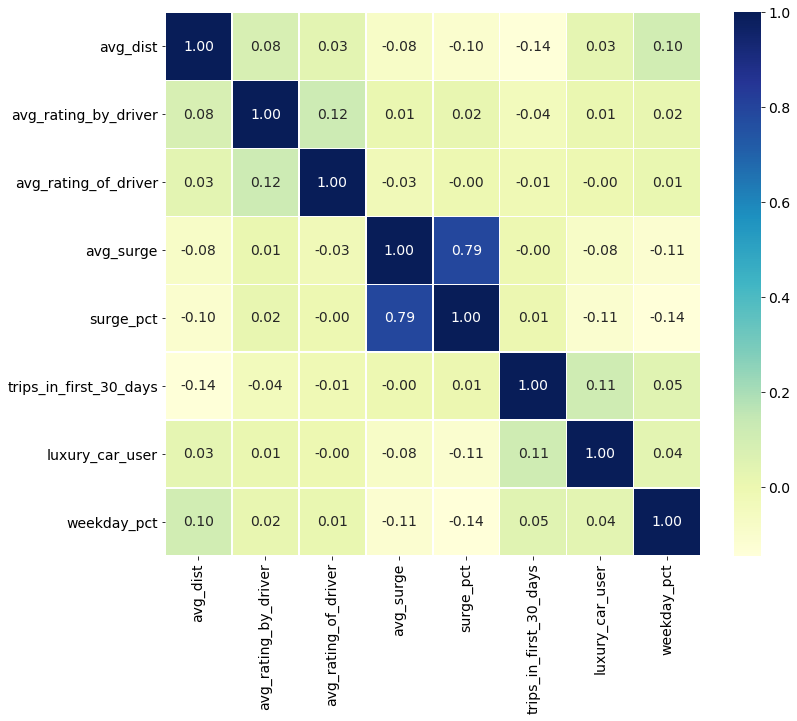
Figure 1: Correlation matrix for the features in the dataset
Since there was no target value in the original dataset, the churn column was engineered from the values of the last_trip_date and the date that the data was pulled, July 1st. If there had been more than 30 days since a user had last ridden and the date the data was pulled, they were said to have churned.
Table 3: Final dataset from cleaned dataset modeling
| avg_dist | avg_rating_by_driver | avg_rating_of_driver | avg_surge | last_trip_date | signup_date | surge_pct | trips_in_first_30_days | luxury_car_user | weekday_pct | city_King’s Landing | city_Winterfell | phone_Android | phone_iPhone | days_since_last_ride | churn | days_since_customer | |
|---|---|---|---|---|---|---|---|---|---|---|---|---|---|---|---|---|---|
| 0 | 3.67 | 5 | 4.7 | 1.1 | 2014-06-17 00:00:00 | 2014-01-25 00:00:00 | 15.4 | 4 | True | 46.2 | 1 | 0 | 0 | 1 | 14 | False | 157 |
| 1 | 8.26 | 5 | 5 | 1 | 2014-05-05 00:00:00 | 2014-01-29 00:00:00 | 0 | 0 | False | 50 | 0 | 0 | 1 | 0 | 57 | True | 153 |
| 2 | 0.77 | 5 | 4.3 | 1 | 2014-01-07 00:00:00 | 2014-01-06 00:00:00 | 0 | 3 | False | 100 | 0 | 0 | 0 | 1 | 175 | True | 176 |
| 3 | 2.36 | 4.9 | 4.6 | 1.14 | 2014-06-29 00:00:00 | 2014-01-10 00:00:00 | 20 | 9 | True | 80 | 1 | 0 | 0 | 1 | 2 | False | 172 |
| 4 | 3.13 | 4.9 | 4.4 | 1.19 | 2014-03-15 00:00:00 | 2014-01-27 00:00:00 | 11.8 | 14 | False | 82.4 | 0 | 1 | 1 | 0 | 108 | True | 155 |
Modeling
One parametric (logistic regression) and two non-parametric (XGboost and Random Forest) models were trained and compared.
Non-Parametric Models
Non-parametric algorithms do not make strong assumptions about the structure in the data. By not making assumptions, they are free to learn any functional form from the training data.
XGBoost
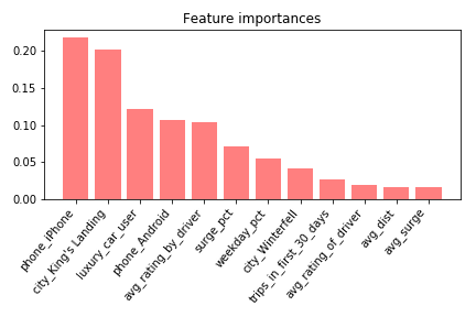
Figure 3: Feature importances for the XGboost model
Test Accuracy for XGBoost model: 78.8%
Hyper Parameters:
- max_depth=2
- learning_rate=0.05
- n_estimators=2000
- subsample = .4
Random Forest
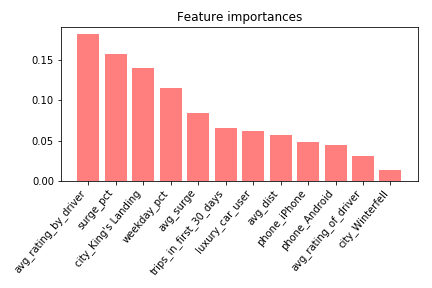
Figure 4: Feature importances for the random forest model
Test Accuracy for Random Forest Model : 77.4%
Hyper Parameters:
- n_estimators=200
- max_depth=10
Parametric Model
Assumptions can greatly simplify the learning process, but can also limit what can be learned. Parametric models simplify the function to a known form.
Logistic Regression
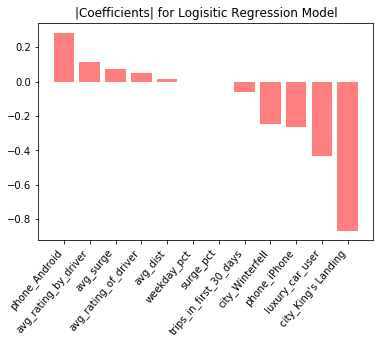
Figure 5: Normalized coefficients for the logistic regression model
Test Accuracy for Logistic Regression Model : 70.8%
Insights
King's Landingand avg_rating_by_driver both show up as high importance features in all 3 models. The feature importances from Figures 3 and 4 are lacking directionality, i.e. they don’t show whether a feature is important in predicting if a user churned.
For interpretability, Figure 5 (the logistic model with normalized coefficients) is interesting, as the coefficients show which features are driving users to stay active (negative coefficients), and which features are leading to user churn (positive coefficients). For example, being a luxury car user is a strong predictor that someone is going to continue using the service. This follows our initial intuition that luxury car riders are going to be less price-sensitive and happier with their experiences overall. Conversely, being an android vs. iPhone user is a high predictor of churn. There could be demographic differences between iPhone and Android users, or it might be that the iOS application provides a superior user experience than the Android version.
Finally, partial dependency plots from the XGboost model show how changes in each feature affect the probability of user churn. Figure 6 shows that, as a customer’s average rating increases, then their likelihood of churning decreases. This is in line with intuition, as customers who are visibly unhappy, perhaps to the point of being reprimanded by their drivers and receiving a bad review, are more likely to churn.
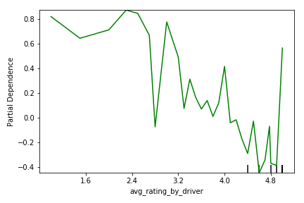
Figure 6: Partial dependency plot showing relationship between churn likelihood (y) and the customer’s average rating by drivers (x)
Figure 7 shows a similar trend to Figure 6, wherein as the customer’s average rating of their drivers increases, their likelihood of churn decreases. Customers who have bad experiences with their drivers are less likely to continue using the service. A user’s rating of the the driver seems to be less important than a driver’s rating of the user as shown by the flatter slope. This could be related to the business model of car-sharing, where drivers who receive more than one negative review are removed from the application. Since drivers are penalized far more heavily than customers for getting bad reviews, the drivers are highly motivated to give great service and get higher reviews. Therefore, there is probably less of a difference in customer service between drivers getting 4 stars vs. 5 stars.
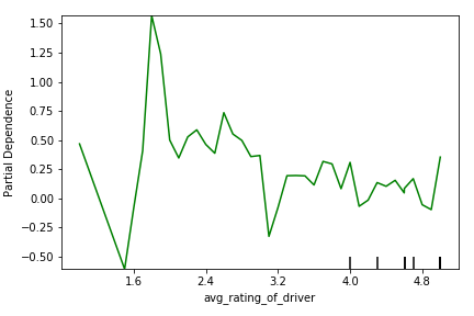
Figure 7: Partial dependency plot showing relationship between churn likelihood (y) and the customer’s average rating of drivers (x)
Figure 8 shows that users who either use the service to only travel very short or very long distances have the highest probability of churning. Possibly users who are consistently traveling long distances seek out alternative transportation methods. Similarly, users who are consistently traveling very short distances could be turning to cheaper methods of transportation, like walking or riding a bike, to avoid the cost.
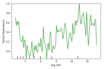
Figure 8: Partial dependency plot showing relationship between churn likelihood (y) and the distance traveled (x)
Figure 9 shows that as the percent of trips taken while paying surge premiums increases, the likelihood of churning increases. This is also a perception of value problem, where customers who pay extra for the service due to demand spikes, don’t see the perceived value in the service and are more likely to discontinue use.
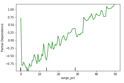
Figure 9: Partial dependency plot showing relationship between churn likelihood (y) and the percent of rides where the customer was paying surge pricing (x)
Figures 10 and 11 show the effect of churn based on the city in which the user is based. Users located in “King’s Landing” and “Winterfell” are more likely to continue using the service than if they are not (i.e., if they are based in “Astapor”). This may be a result of, e.g., how dense the cities are and what other forms of transportation are available in each city.
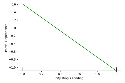
Figure 10: Partial dependency plot showing relationship between churn likelihood (y) and whether the user was based in King’s Landing* (x=1)
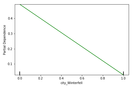
Figure 11: Partial dependency plot showing relationship between churn likelihood (y) and whether the user was based in Winterfell* (x=1)